
 When Dark Souls II came out in early 2014 there was a big kerfuffle over the lighting system being significantly different at release than what was shown in demonstrations months before. To many, it was a devastating change and a detriment to the final product. The change was necessary to make the game run smoothly – a necessity in Dark Souls, and most people understood and appreciate that – but still, there was disappointment to be felt by some who really enjoy games that can create a life-like and immersive world to play in.
Old systems don’t have ‘lighting systems’, or anything beyond displaying arranged colors. The NES was only able to display up to 25 colors on screen at a time out of a selection of 64 – give or take. There were lots of tricks and bypasses to pushing the NES’s limits, and the details of those are little too complicated for me to easily understand. The original Game Boy only had 4 shades of grey scale to work with. All this is to say, with such small tool sets at their disposal, how did the early games create such strong pulls of immersion?
Early games had to use game play itself to create the kinds of tension, tone and emotion they wanted to convey in their product. It was the player themselves who dictated all those elements by how they felt playing the game. And among the best games to utilize these principles were the Legend of Zelda.
As I said before, the NES had a very limited color palate to work with. And even that just shows what they were allowed to use, not how they were allowed to use it. The original Legend of Zelda created a strong sense of environment, at least between the overworld and dungeons.
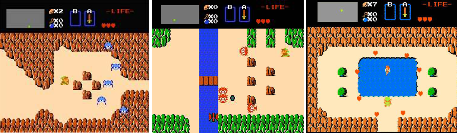
The overworld is really bright and colorful. The ground underfoot is kind of a clay color – it looks sun baked. The shading under the trees or bushes is centered underneath, making it seem like the sun is at noon positioning where everything is at it’s brightest. They tried their best to make the water sparkle with little dots all over it.
An effect they establish early on in the game is going up and down stairs. Entering a cave is one of the first things you do, and you see link kind of sink down into the black hole in the side of the rock face. It really let’s you know that there is a world above and a world below. And that world below is quite different than what’s on top.

The dungeons in Zelda 1 are mostly comprised of just a single color spectrum – greens, blues whites etc. The tiles in the dungeons look cold and there really aren’t any shadows. And down here there’s danger and risk unlike what you find in the overworld. Your goal is to go deeper into the dungeon, and dying along the way kicks you back and makes you start over. Stress builds when you know you’re really deep in and you don’t want struggle to do it all again. Finally getting to the end of the dungeon has you obtaining a piece of the triforce, your prize. After you get the triforce the screen shutters to black and then opens up immediately to Link walking up the stairs at the dungeon entrance into the overworld. You go from a stressful, cold, underground space to rising up into the warm sun-kissed world above.
The game play created the feelings of stress, and triumph; but the colors and visual style created the presence. They took simple concepts like cold, enclosed spaces to equate with danger, and warm open vistas to signal victory.
Since the beginning of the words ‘graphics’, game designers and players have equated ‘more advanced’ with more immersive. And maybe for some, that’s the case. But sometimes a little imagination can go a long way.


